Lightroom Basics
- Mel

- Oct 3, 2020
- 3 min read
Updated: Oct 16, 2025

I'm finally getting to tackle photography, specifically editing on Lightroom. I've enjoyed my own learning process and I'm excited to share what I know with you in the simplest ways possible.
First, let me tell you why Lightroom is a really good app to have. For one, it's free (the MOBILE version). Secondly, it allows you more flexibility than apps like VSCO (their free versions anyway). Finally, Lightroom deals with presets, these 'filters' so to speak that allow your images to have specific looks and moods.
But before talking about presets, I want to show you some basics. We'll start with LIGHT, then move to COLOR. So, let's get into it...
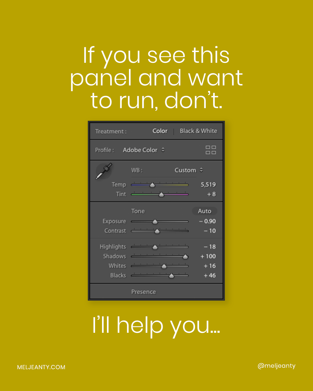
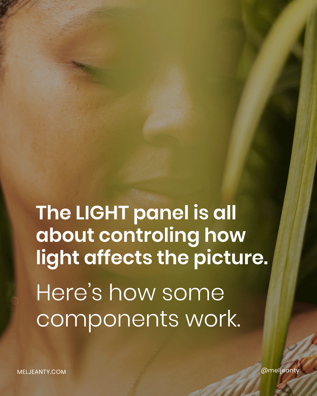
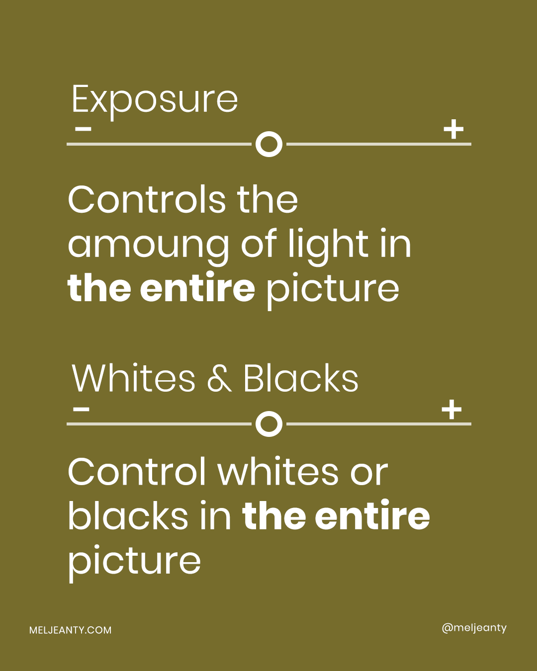
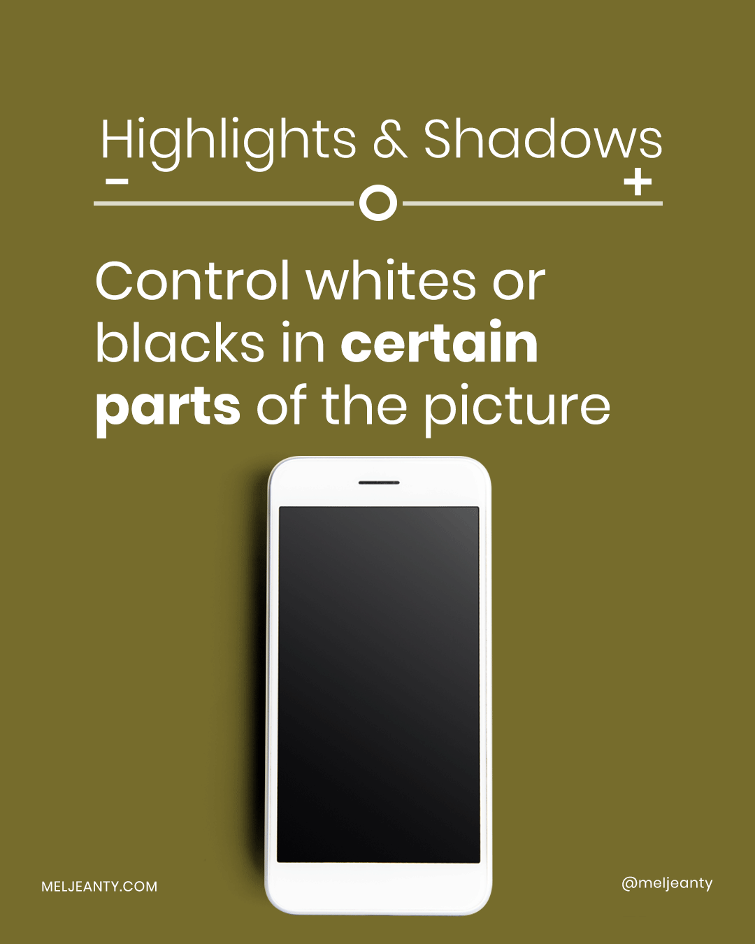

One of the first things I tend to go for when editing is LIGHT. I go to exposure to make sure that the overall picture is well 'balanced'. Then, I move on to whites and highlights, to make sure that nothing is too 'bright' to the point of being unnatural. Finally, I tackle the shadows and blacks.
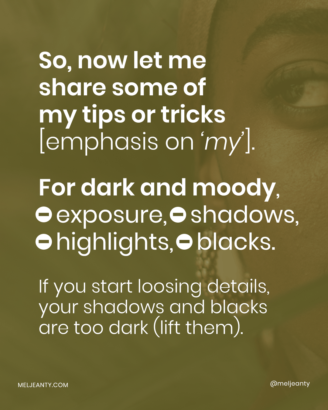
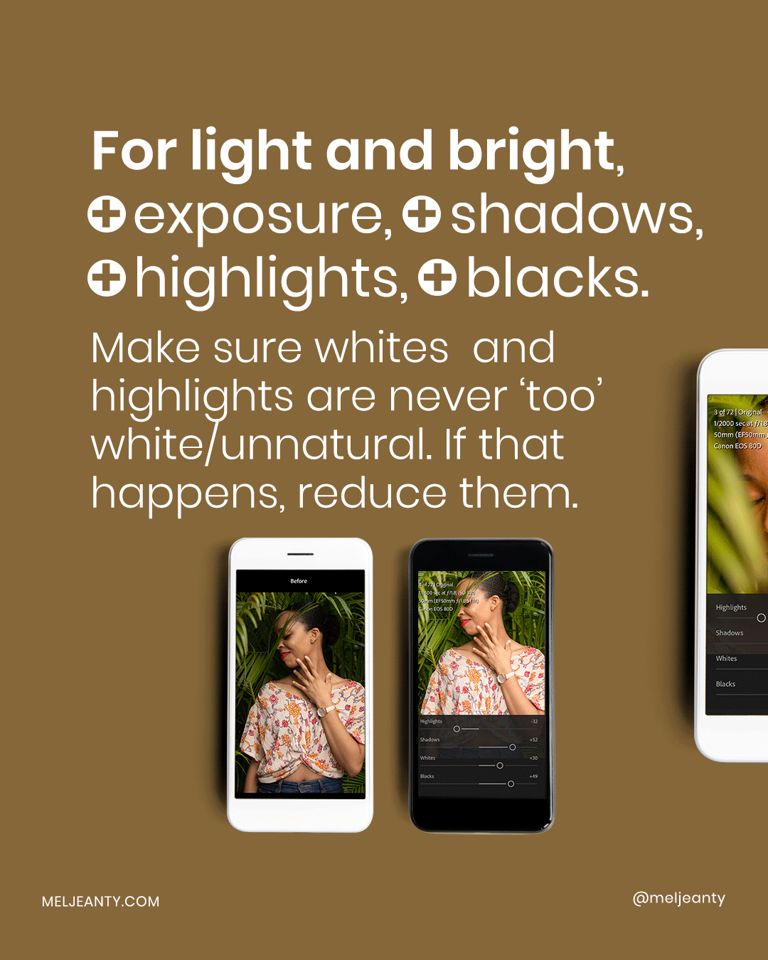
One of the ways you can gauge where to stop is by looking at the whites and the blacks on the image. If the darker areas of the image are so dark that you lose details (in the hair for example), then all you have to do is increase until you get some sort of equilibrium. If the lighter/whiter areas of the picture are so white it feels uncomfortable (overexposed), simply reduce the whites or the highlights (or even the overall exposure) until you're satisfied.
Here, with this preset, I wanted a soft look so I reduced the contrast as much as possible by dialing down the contrast panel but also by increasing the shadows and blacks panel. At the end of the day, it's all about preference and intention. And loads of experimenting as well!
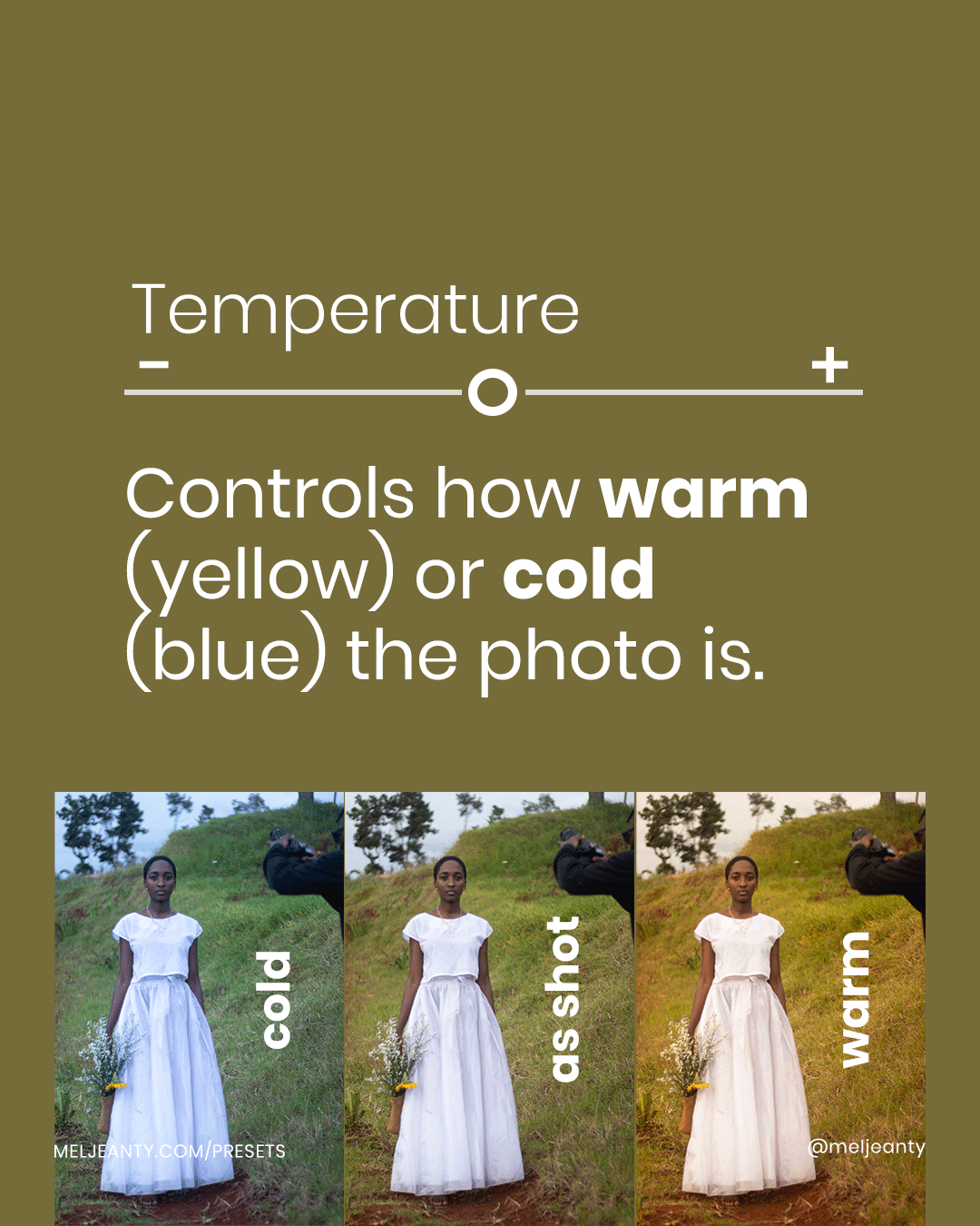
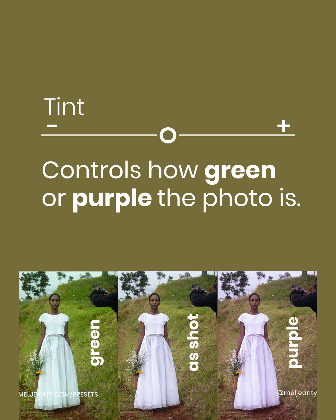
Now, let's talk about COLOR. The first two panels for color are Temperature and Tint. Usually, before editing a photo, it's good to 'white balance' the photo, to make sure that you're starting with a 'true' blank slate. In Lightroom, you can use the dropper to get the software to white balance your photo for you. All you have to do is put the dropper on a part of the image that is white or black. Then, playing with Temperature and Tint becomes about preference and intention. Whatever mood you feel from the picture or that you want to add to the picture, you can use those panels to help you achieve it...
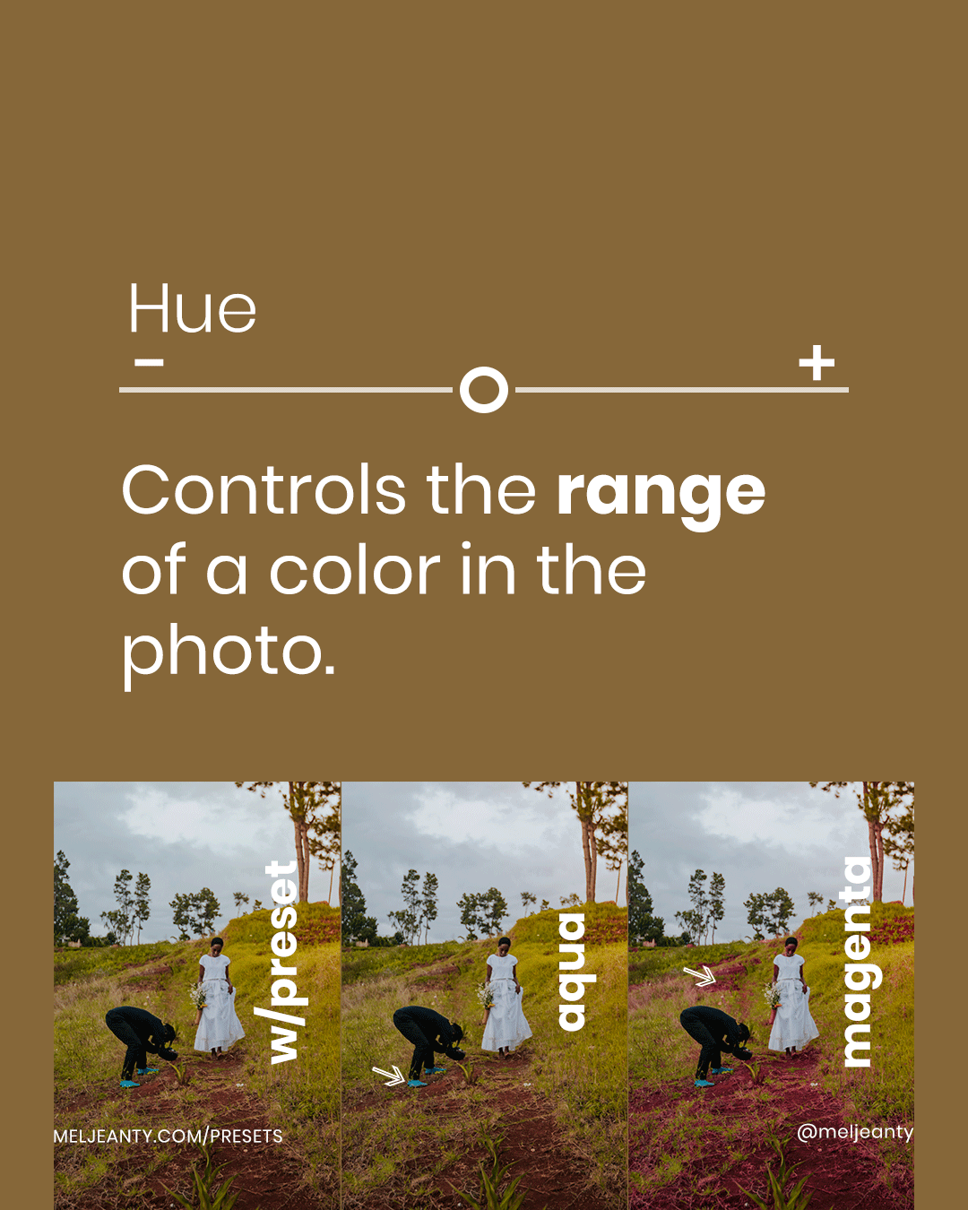
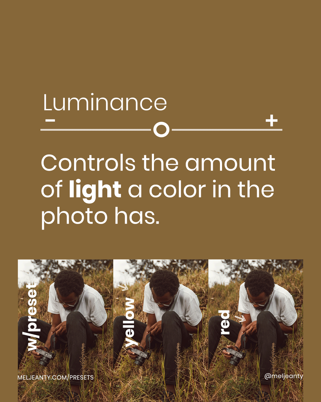
From there, you can move on to the HSL panels. I love this set of panels in particular because they allow me to play and control individual colors.
With Hues, I can turn greens into blues for example. This is particularly helpful to me when I'm editing for my Instagram feed. Usually, I'm trying to make sure that the colors in a picture, for an upcoming post, match the colors for the previous posts (same shade of blue for the sky for example).
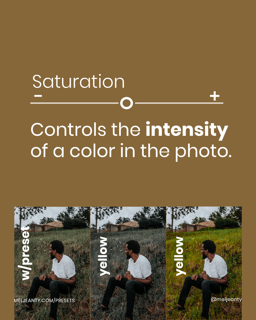
Saturation is another way to play around with color. I especially like having control of that panel when I want to decrease the intensity of one color but not for the whole image (skin too orange for example).
Finally, we have Luminance. When it comes to skin tone, especially brown skin, I like to play with the oranges and reds to match, as much as possible, the shade of brown of the person with the photo. I also use it to brighten certain areas, etc. This really is an amazing tool!
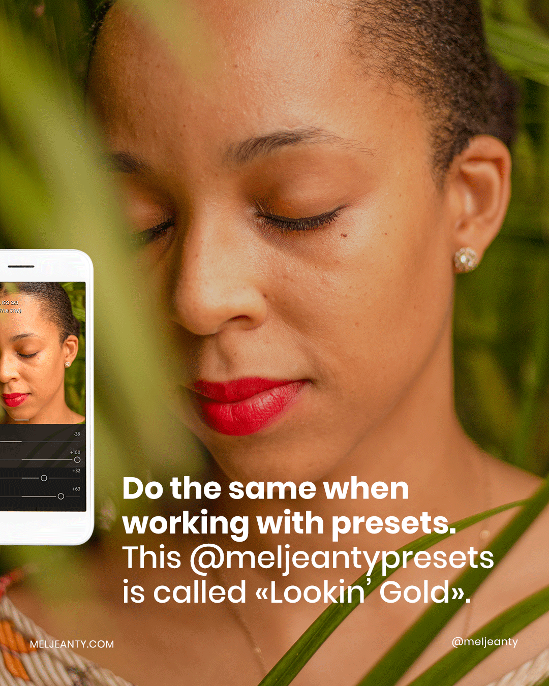
Okay friend... If this was a whole lot of information and you're not sure where to start, that's totally fine. With practice, you'll start to get the hang of things. One way to practice editing on Lightroom is by having a starting point such as a preset.
I recently released a quick tutorial on editing in Lightroom Mobile with a preset and, I think this will be helpful to you...
I've also released a few new presets on the site. They're of varying moods and colors, and they bring me so much joy. So many of you have complimented me on my own Instagram feed and so, I worked on creating presets that could help bring that same joy and life to your photos as well.


You can check out the site to learn more or hang out on Instagram to see how special each preset is.


Comments